The delights of color have captivated human attention since before we were humans.
The primordial versions of ourselves experienced a world without color. Can you imagine?
In that world, the difference between a ripe, red apple and an unripe, green apple was undetectable. In fact, scientists now believe we developed the ability to perceive colors so that we could better identify our food.

Apple on Table by Marsden Hartley
Since then, the human experience of color and food has been inextricably linked. Research has shown that color even affects the way we perceive the taste of food. A bright red tomato is tastier than a dull one, or at least that’s what our brains want us to believe.
Color has also been shown to influence our mood, emotions, and actions. The field of color psychology studies how color shapes our behavior, though much about this connection remains unknown.
Colors have adopted cultural significance as well. In China, red represents happiness, good luck, and fortune. In Western culture, purple was the color of royalty because of its scarcity in the natural world and its pigmentation’s durability.
The importance of color in our lives can’t be understated.
Color has taken on biological, psychological, and anthropological significance... and yet, color doesn’t exist.
Color is an illusion created by our brains. What we “see” is nothing more than different wavelengths of light processed through photoreceptors in our eyes. That data is sent from our eyes to our brains where each wavelength is assigned a color. The mechanics of this translation process – why certain wavelengths are assigned certain colors – is still a mystery.
“I found I could say things with color and shapes that I couldn't say any other way.” —Georgia O’Keeffe
Color’s most captivated audience is perhaps not scientists, but artists. Starting with the multi-talented Renaissance genius Leonardo da Vinci, who wrote about his observations of colors, a tradition of color theory was born.

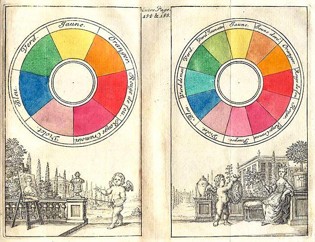
Color theory is a collection of ideas and observations that seeks to help artists and designers communicate meaning through color. In the most traditional version, color theory is represented by a color wheel depicting the relationship between primary, secondary, and tertiary colors.
Go one level deeper and color theory takes on a whole new applicable life when you explore color harmony. Color harmony provides direction on how to select color combinations that are aesthetically pleasing using the placement of colors around the wheel. Selecting opposite, complementary colors creates sharp contrast while selecting three equidistant colors in a triadic combination can evoke a sense of playfulness with its more subtle contrast.

The classic color wheel stems from the writings of Isaac Newton in his book Opticks from 1704. (Newton, of course, is best known as the grandfather of gravitational theory, which he discovered after a fortuitous encounter with - what else? – an apple.) For almost 300 years, the color wheel has served as a practical guide to color mixing.
But in more recent history, color theory has taken on an abstract perspective. The conversation has shifted from the scientific properties of light to the perceptive nature of our brain. In other words...
It’s become less interesting to know how colors interact with each other, but rather how colors interact with us.

The best example of this shift can be seen in the works of Josef Albers, the renowned artist and teacher of the mid-20th century. Albers was born in Germany in 1888 and grew up in a family of handworkers and artisans. A stained-glass maker by trade, Albers taught at the famous Bauhaus, a German art school that inspired a generation of design.
When the Bauhaus closed in 1933, Albers and his wife, textile artist Anni Albers, emigrated to the United States and continued teaching, first at Black Mountain College in North Carolina and later at Yale in New Haven, CT.

An experiment from Interaction of Color by designer Jeff Zych. The dots are the same color, but appear different because of their relationship to the colors surrounding them.
In 1963, he published Interaction of Color in which he asserts that the true nature of color is that it "is almost never seen as it really is." The book includes a series of experiments for readers to try, the idea being that colors must be experienced to be understood because “experience teaches that in visual perception there is a discrepancy between physical fact and psychic effect.”
It’s in this spirit of playfulness and experimentation that color is best understood in our own lives and homes. The subjectivity with which we experience color is such a highly personal affair that no color wheel could ever give us better guidance than our “gut instinct” can provide.
The journey to understanding your personal color theory - how you relate to colors and how they relate to you - is a lifelong one.
If we allow ourselves to indulge, colors can elevate our moods and calm our minds.
Colors quite literally light up the world, so why don’t you let them in to yours?
A great place to start is with a simple, ephemeral tool - flowers. Bring home some flowers - it’s best if they’re all one color. Place them in your living room and notice how they interact with the objects around them.
Experiment throughout the day by moving the flowers around. Place them in different rooms, or in front of different color walls. Notice how each of the spaces changes with the flowers. Does your mood change with it?
Get more gutsy and experiment with different colored flowers based on the approach to color harmony outlined above. Utilizing flowers as you explore color theory and color harmony can be a solid yet low-stakes way to understand what color combinations incite personal pleasure and bring you joy.

These bold pieces play off each other in a space with the strong red of the Madda Chair enlivened by its analogous relationship to the blue of the Milking Stool.
The same experimentation can then be done with other elements of your home - furniture, art, books and accessories. Place this bold red chair in your living room - how does it interact with the rest of the room? How does it make you feel?
Even though color only exists in our mind, learning to notice colors as we perceive them and being aware of the combinations that are pleasing to our mind’s eye is a valuable, lifelong pursuit. I’m constantly playing with color in the spaces I live and work in, through the clothes I wear, and during my daily art practice - and I encourage you to find ways to experiment and have fun with color in your life too.

Tayler Carraway is co-founder of Happy Medium, a modern art supply brand for casual artists who believe that art is not about what it looks like, but how it makes you feel. Before starting Happy Medium, Tayler worked for iconic brands like Ralph Lauren, J Crew, and Victoria's Secret building out their eCommerce businesses.